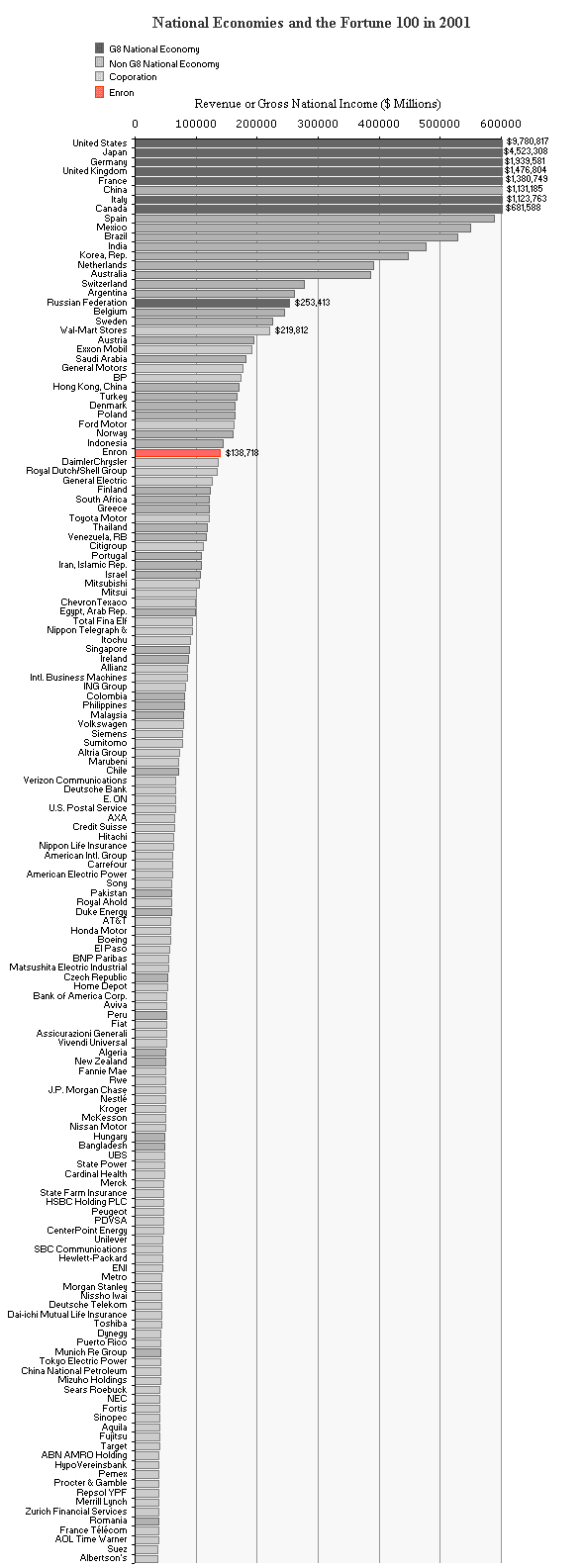
Obviously it can’t be done! It’s like comparing apples and oranges. Corporate revenue and Gross National Income GNI don’t measure the same thing. Double counting is the least of your problems. But plotting them on the same graph is interesting! It gives you a very approximate graph of financial influence for Nations and Corporations. The most recent freely available data is for 2001. So I merged the data from the World Bank and the Fortune Global 100 and then plotted it. And what did I find. Wow, the Enron debacle has to be the largest crime ever! Check this out…