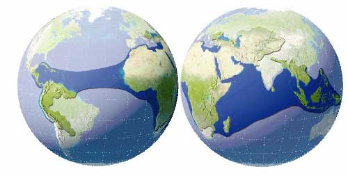
In 1999 Ryan McCormack and I wrote a marketing piece on Globalization for Sapient Corporation. Aimed primarily at raising awareness of the issues involved in building global Internet systems it also touched on national market analysis and selection. I was reminded of this diagram showing income and connectivity for every country in the world from that piece while reading various articles on US Foreign Policy recently. These articles included this piece called the Pentagons new Map by Dr Thomas P.M. Barnett a US military Strategist on Globalization and US Foreign Policy.
Basically I think Dr Barnett is on to something when he claims that “disconnectedness defines danger”.
Show me where globalization is thick with network connectivity, financial transactions, liberal media flows, and collective security, and I will show you regions featuring stable governments, rising standards of living, and more deaths by suicide than murder. These parts of the world I call the Functioning Core, or Core. But show me where globalization is thinning or just plain absent, and I will show you regions plagued by politically repressive regimes, widespread poverty and disease, routine mass murder, and “most important” the chronic conflicts that incubate the next generation of global terrorists. These parts of the world I call the Non-Integrating Gap, or Gap.
Having said I think Dr Barnett is on to something I don’t think his conclusions are correct! He makes three mistakes;
-
He confuses poverty with danger. Deliberate disconnectedness is dangerous for everyone, whereas poverty is only dangerous for the poor. Lumping the poor and the dangerous together is callous.
-
He attempts to define a contiguous geographic region of the World that he calls the “Non Integrating Gap”.
In this regard he makes a fundamental mistake. Conectedness is a network property and networks are fractal not contiguous. There is no contiguous region that is disconnected. Within each disconnected country there are islands of connection and within each connected country there are islands of disconnection. This is true at all levels, continents, nations, regions, cities, and companies, right down to individuals. There are terrorist cells in US cities fighting to disconnect the world and Journalists with satellite cell phones in remotest Afghanistan, Iraq, and Somalia working to connect everything.
- A corollary of the contiguous region hypothesis is the idea of seam states that buffer the integrated core from the non integrating gap. As there is no contiguous region there can be no border, or rather the border is infinitely long. Either way the concept of Seam States is meaningless.
Income and Connectivity
I believe a better analysis can be produced by considering relative income and connectedness. I used per capita income as calculated by the World Bank and the number of Internet hosts as counted by the Internet Software Consortium (see assumptions). By plotting these two factors against each other for every national economy a picture emerges. Not surprisingly there is a correlation between these two factors – richer countries tend to have greater connectivity. But countries also tend to cluster by geographic region. The graph below clearly shows clustering of Sub Saharan African, Middle Eastern and North African and European economies. Over time economies tend to move to the top right of the graph – they increase per capita income and Internet penetration. The rate at which they move seems to be determined by their per capita income. Wealthy countries can adopt the Internet more quickly than poor countries. But there does seem to be a limit to the speed with which a country of a given per capita income can adopt the Internet. Most countries seem to move at this limiting speed and so a wave front of countries seems to have developed all rushing as fast as they can afford toward greater connectivity and wealth. One interesting feature of this graph is the countries that are not in their expected place on the wave front. It is these countries that are the subject of rest of this article.

The Outlier Economies
The graph above identifies several exceptional economies. These economies do not behave according to type. They are significantly different from their neighbors. They are outliers, islands of relative connectivity in a sea of disconnection like Israel, South Africa, and Kuwait or the reverse such as Burundi, Ethiopia, and Yemen. For example Israel, unlike it’s middle eastern neighbors behaves like a European economy with respect to income and connectivity, South Africa is significantly more connected and wealthier than the rest of Sub Saharan Africa. While Kuwait and Yemen show opposite extremes, one enjoys fabulous wealth while the other suffers crushing poverty. These outlier economies are similar to Dr Barnett’s seam states, however they do not surround anything in fact they are themselves surrounded. As a result of their isolated status they tend to get involved in conflict with their neighbors.
The Reluctantly Connected Economies
There are many economies that are unable or unwilling to achieve levels of connectivity that economies with similar incomes manage to sustain. These economies fall behind the wave front, they are the reluctantly connected. There is a significant risk that these economies will backslide and become disconnected. Preventing this backsliding and ensuring these nations realize the full benefits of connectivity should be a major objective of the connected world.

The Disconnected Economies
Finally there are economies that could not be plotted on these graphs because the necessary data are unavailable. I believe these fall into three main categories. There are a few dependant territories like the Faroe Islands, Guam, and Greenland that can be discounted because their data are included in other economies. Then there are the economies disconnected by paranoia, fear and hatred and finally the economies disconnected by secrecy. The table below is ordered by population size and shows a fairly clear division. The larger states are the pariah states – dangerous, paranoid and in some cases anarchic states that refuse to publish economic information even if they have the capability to gather the data. The smaller states are the hear-no-evil, see-no-evil, speak-no-evil bankers, protecting their clients and their own economies. These offshore tax havens and centers of secretive banking often serve the pariah states, and their corrupt leaders. Both these types of economies are dangerously disconnected. The world would be a far better place if they became fiscally transparent, connected economies.
| Economy | Hosts | GNI (Atlas Method $) | Population (1000s) | Status |
|---|---|---|---|---|
| Congo (Democratic Republic) | 113 | 0 | 52360 | Pariah State |
| Myanmar | 2 | 0 | 48315 | Pariah State |
| Sudan | 0 | 330 | 31687 | Pariah State |
| Afghanistan | 2 | 0 | 27248 | Pariah State |
| Iraq | 0 | 0 | 23750 | Pariah State |
| Korea, Dem. Rep. | 0 | 22384 | Pariah State | |
| Syrian Arab Republic | 0 | 1000 | 16593 | Pariah State |
| Cuba | 848 | 0 | 11222 | Pariah State, hold over from the cold war |
| Senegal | 480 | 9769 | No Internet Host count available | |
| Somalia | 1 | 0 | 9089 | Pariah State, Anarchic |
| Haiti | 0 | 480 | 8114 | Pariah State |
| Benin | 0 | 360 | 6437 | No Internet Hosts in 2001 |
| Libya | 59 | 0 | 5410 | Pariah State |
| Nicaragua | 1655 | 0 | 5202 | |
| Puerto Rico | 1667 | 0 | 3950 | US Dependent Territory |
| Liberia | 0 | 0 | 3216 | Pariah State |
| West Bank and Gaza | 1350 | 3091 | Dependent Territory, Pariah State, Emerging Nation ? | |
| United Arab Emirates | 29029 | 0 | 2976 | Fiscally Secretive |
| Oman | 646 | 0 | 2452 | Fiscally Secretive |
| Qatar | 0 | 0 | 598 | Fiscally Secretive |
| Equatorial Guinea | 0 | 700 | 469 | Pariah State |
| Brunei | 4398 | 0 | 345 | Fiscally Secretive |
| Netherlands Antilles | 104 | 0 | 217 | Dutch Dependent Territory, Fiscally Secretive |
| St. Lucia | 3970 | 158 | Fiscally Secretive | |
| Guam | 149 | 0 | 157 | US Dependent Territory |
| Channel Islands | 0 | 149 | UK Dependent Territory | |
| Mayotte | 0 | 0 | 145 | French Dependent Territory |
| Virgin Islands (U.S.) | 58 | 0 | 122 | US Dependent Territory |
| St. Vincent and the Grenadines | 2690 | 116 | Fiscally Secretive | |
| Aruba | 785 | 0 | 104 | Dutch Dependent Territory, Fiscally Secretive |
| Isle of Man | 116 | 0 | 75 | UK Dependent Territory |
| Northern Mariana Islands | 13 | 0 | 72 | US Dependent Territory |
| Andorra | 876 | 0 | 67 | Fiscally Secretive |
| American Samoa | 915 | 0 | 65 | US Dependent Territory |
| Bermuda | 4892 | 0 | 63 | UK Dependent Territory, Fiscally Secretive |
| Greenland | 2229 | 0 | 56 | Effectively a Dutch Dependent Territory |
| Faroe Islands | 1588 | 0 | 45 | Dutch Dependent Territory |
| St. Kitts and Nevis | 6880 | 41 | UK Dependent Territory | |
| Cayman Islands | 533 | 0 | 35 | UK Dependent Territory, Fiscally Secretive |
| Liechtenstein | 762 | 0 | 32 | Fiscally Secretive |
| Monaco | 434 | 0 | 32 | Fiscally Secretive |
| San Marino | 673 | 0 | 27 | Effectively an Italian Dependent Territory |
| Timor Leste | 6 | 0 | 0 | Emerging Nation, Destitute |
Assumptions and Sources
All the data used was for 2001.
I assumed that the number of hosts that use the assigned Top Level Domain (TLD) for a given country is an excellent indicator of the connectedness of that country. I believe this because hosts (computers) themselves are tradable commodities that must be purchased from abroad and that connection to the Internet is a very real sign that someone in a country wants to realize the benefits of connection to a global communication medium. Data for the number of hosts per country came from the Internet Software Consortium July 2001 Survey. Assuming Top TLDs actually map to countries leads to errors. In particular for the US since very few US hosts actually use the US domain. I totaled the following TLDs to get values for the US (net, com, edu, org, mil, us, arpa, gov, unknown). This of course is incorrect but I assumed it would tend to boost the US values higher and reduce the values for all other countries proportional to the number of hosts in the country. Three TLDs were ignored (int, biz, info), they have so few host that would make no difference anyway.
Data from the World Bank was used for population values and per capita income.
I have not produced charts for all regions of the world. Here is the zipped excel spread sheet I used. Feel free to play with these data yourself. I’d be interested in seeing what you come up with.